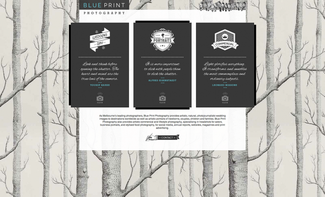
We saw the three elements of our business, Wedding, Portrait, Commercial, as three little kids who where growing up too fast and needed their own space to express their individuality. We approached Malt Creative to help us expand the existing website and diversify the three core areas of our business via a new landing page. Our brief was something clean, and contemporary that expressed the true value and emotion we have for photography.
The draft landing page design is emailed and Malt Creative have nailed the brief. The graphic of a tree on the landing page, represents paper as we believe an image file isn’t a photograph until it’s printed. The importance and experience of feeling something tangible with a printed photograph is something a screen can never truly provide.
The bird’s tweeting away on the top are a little quirky family sharing their photos and inviting you into our website. We also added a slideshow option to share some of the stories we have told with our photos.
Gina and I love the new landing page which represented our artistic style. The quotes by three world famous photographers, whose work inspires us, represented the core foundations behind our images. For us it’s the three thing we do before we even press the shutter: Connecting with the people, drawing on our own life experiences and emotions to tell a story, and how the quality of light is paramount in any great photo.
They say good things come in threes so please enjoy taking a tour of our revised website. We would love to get any feedback you may love to share.
We hope you enjoy the story! http://www.blueprintphoto.com.au

